Styling Advice & Guide
Choosing what to wear for your session can feel overwhelming, but it doesn’t have to be. This guide is here to take the stress off your shoulders and give you simple, practical tips to help you feel confident and comfortable in front of the camera. From color palettes that photograph beautifully to outfit combinations that flow together, you’ll find everything you need to create looks that reflect your personality and let your love + connection shine through. Think of this as your little roadmap to styling made easy — so all you have to focus on is showing up and being yourself.
Color Palettes
The Base of your outfit
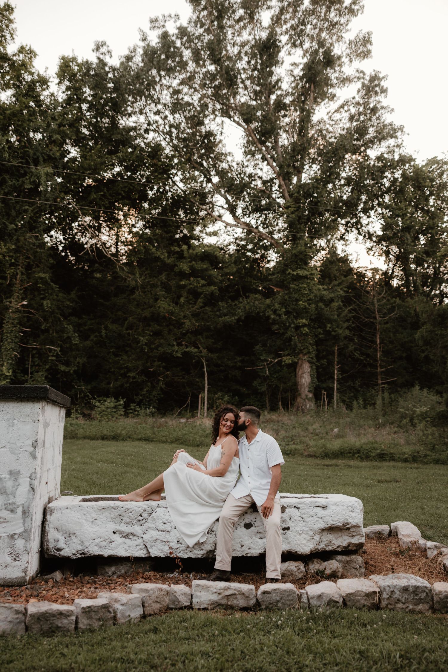
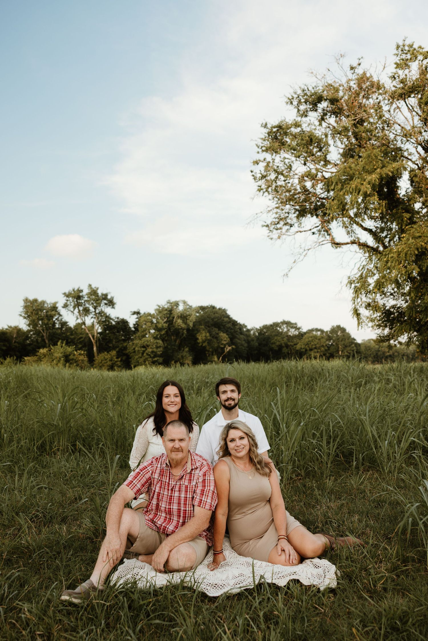
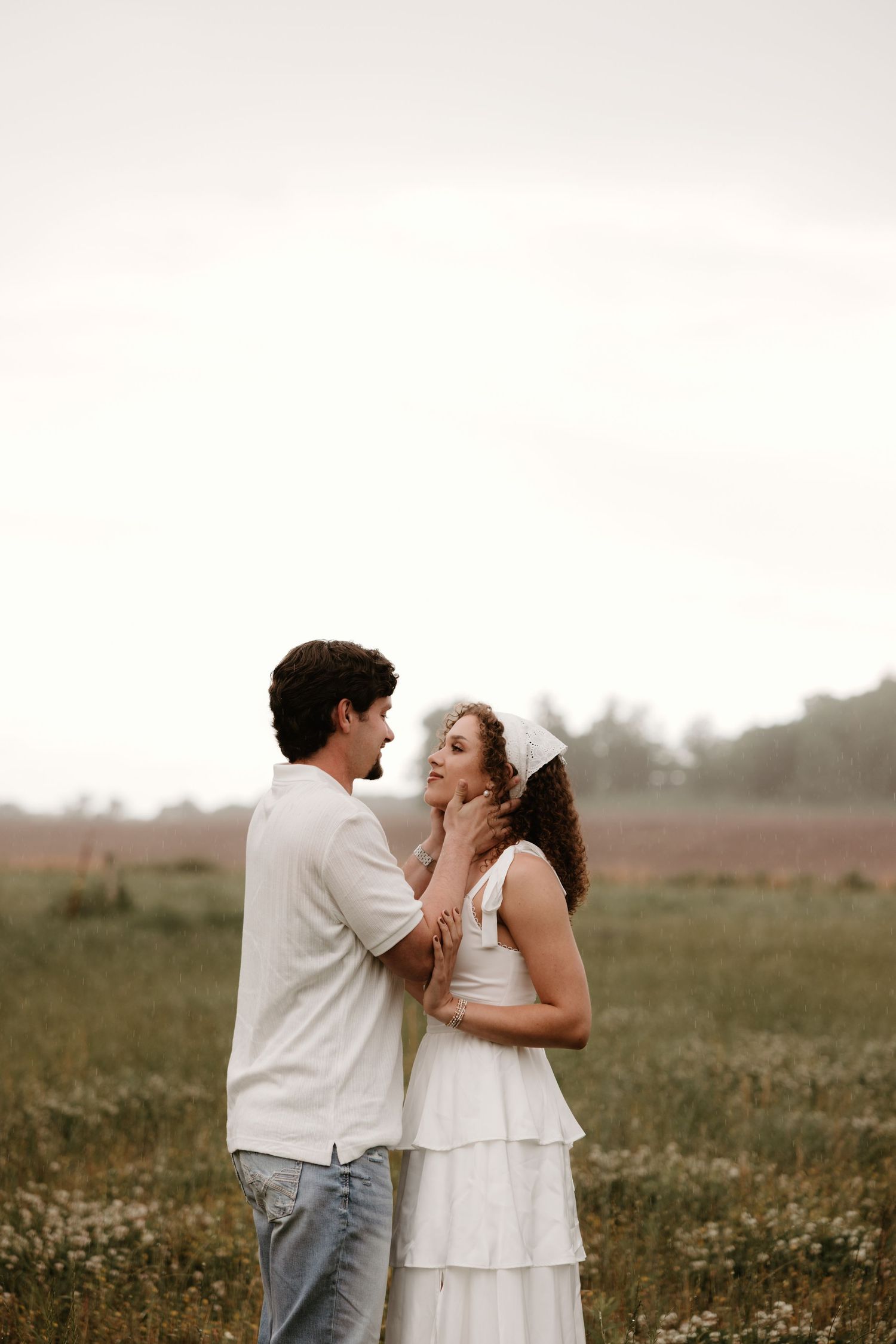
When it comes to color, keeping things creamy, neutral, and soft is the best way to complement my editing style. Think warm beiges, soft whites, taupes, sage, rust, and muted tones that feel timeless and natural. These palettes photograph beautifully, stay cohesive across group shots, and allow your connection to take center stage — which is exactly what we want your images to reflect.
Textures + Layers
Added fun to your pictures
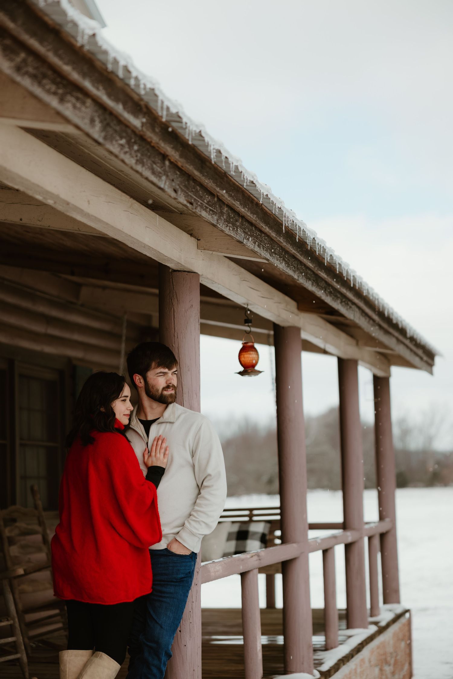
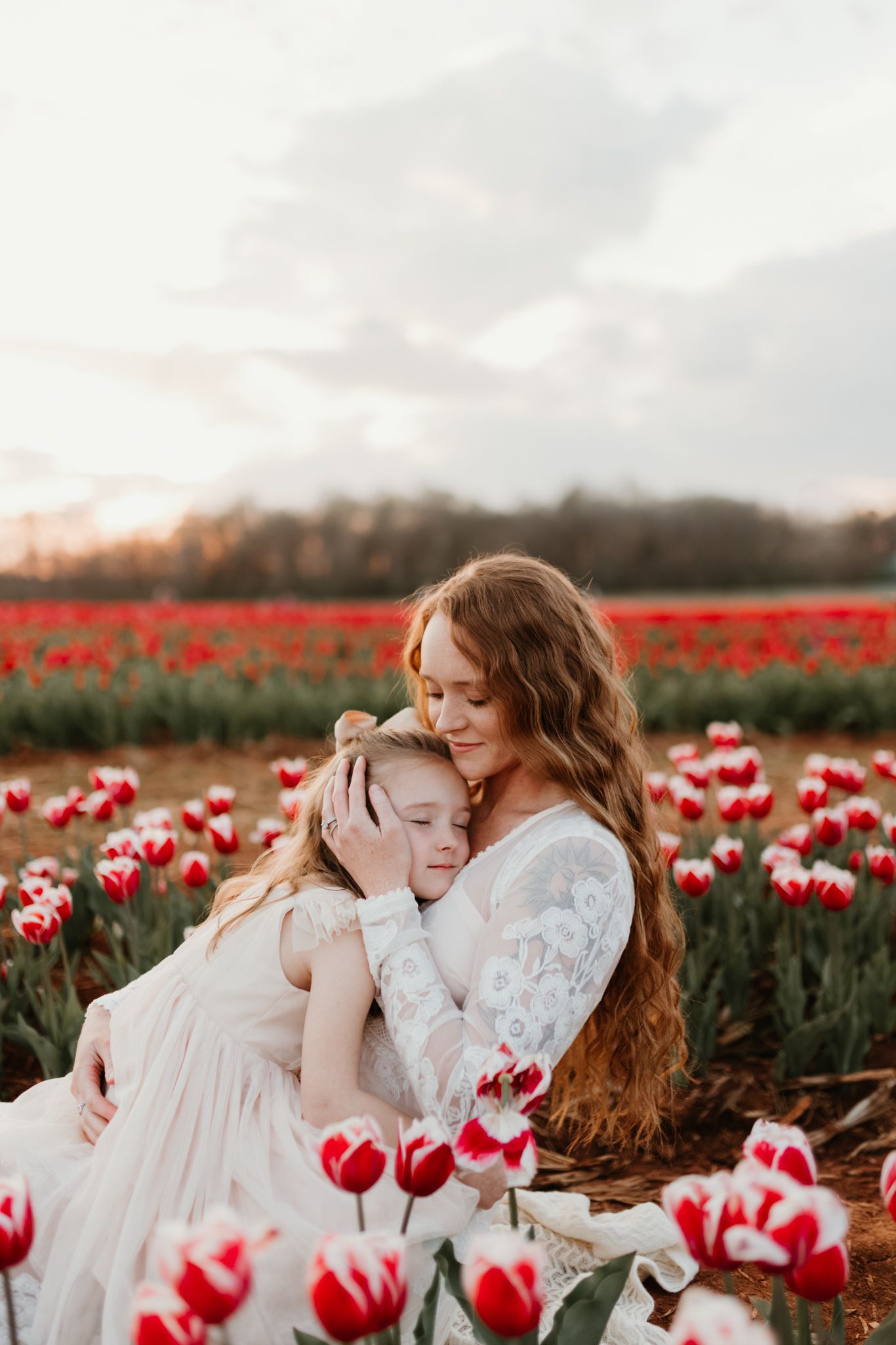
Textures and layers bring so much life to photos — they add depth, movement, and a natural variety that makes your images feel rich and dynamic. Think cozy knits, flowy linens, gauzy fabrics, lace details, or a structured jacket tossed over a simple dress. Layers also give us options: a cardigan that can be slipped on or off, a scarf that can be styled different ways, or a hat that adds just the right amount of personality. These small details keep your photos looking effortless while adding that extra touch of storytelling and visual interest.
Seasonal Tones
for optimal seasonal beauty
NEUTRAL TONES
WARMER TONES
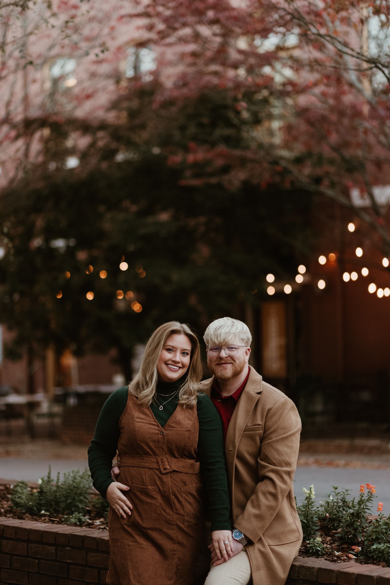
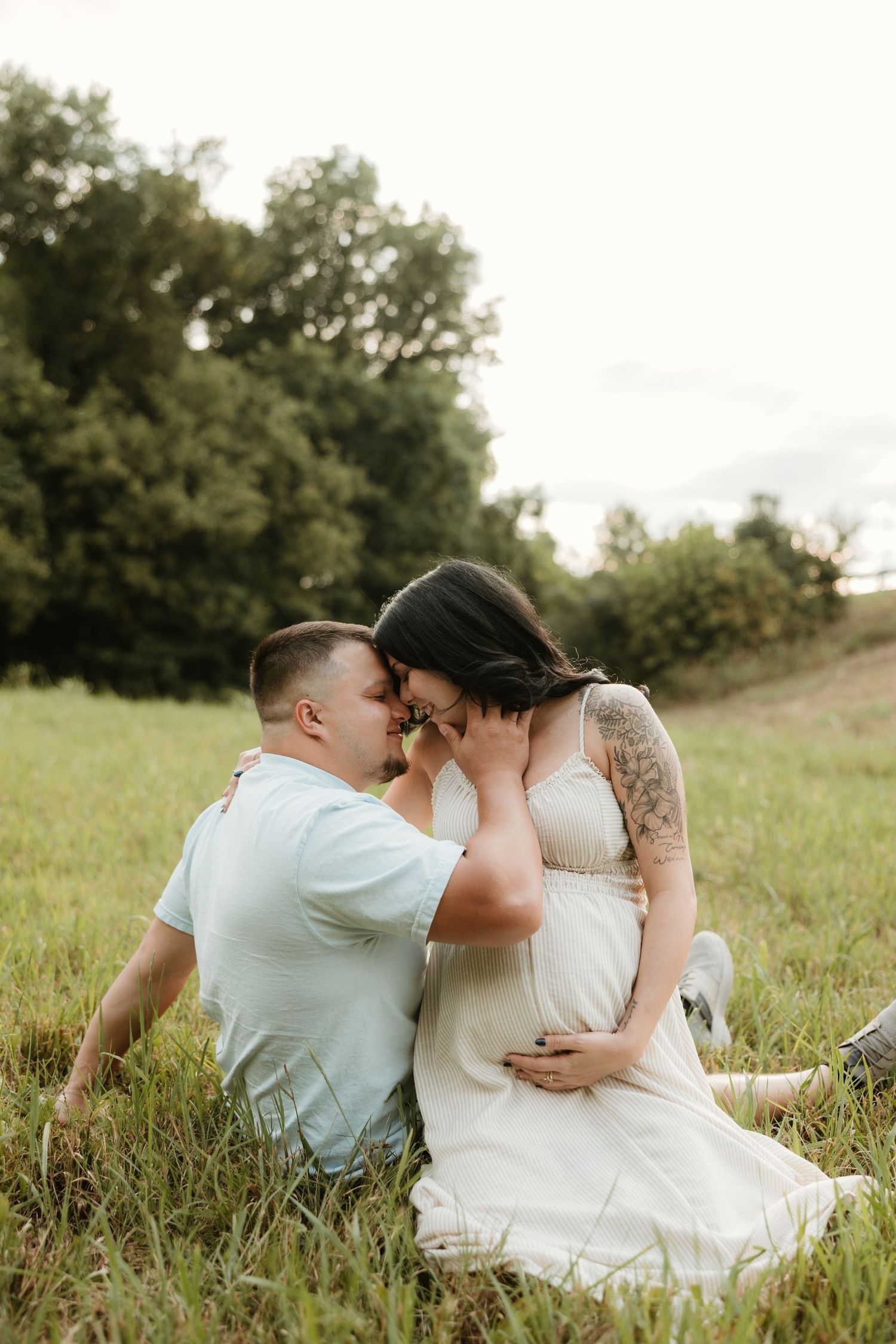
The season you’re shooting in can completely change how colors come to life in your photos. For summer sessions, light and airy neutrals paired with soft pastels are perfect — think cream, sage, dusty blue, mauve, and sandy beige. These tones feel fresh and dreamy against golden fields, green trees, or water backdrops. For fall sessions, I recommend leaning into warmer, deeper shades that mirror the season — rust, terracotta, mustard, olive, chocolate, and muted burgundy. These colors pop beautifully against autumn leaves and moody skies, while still blending seamlessly with my editing style.
fall+ Winter palette
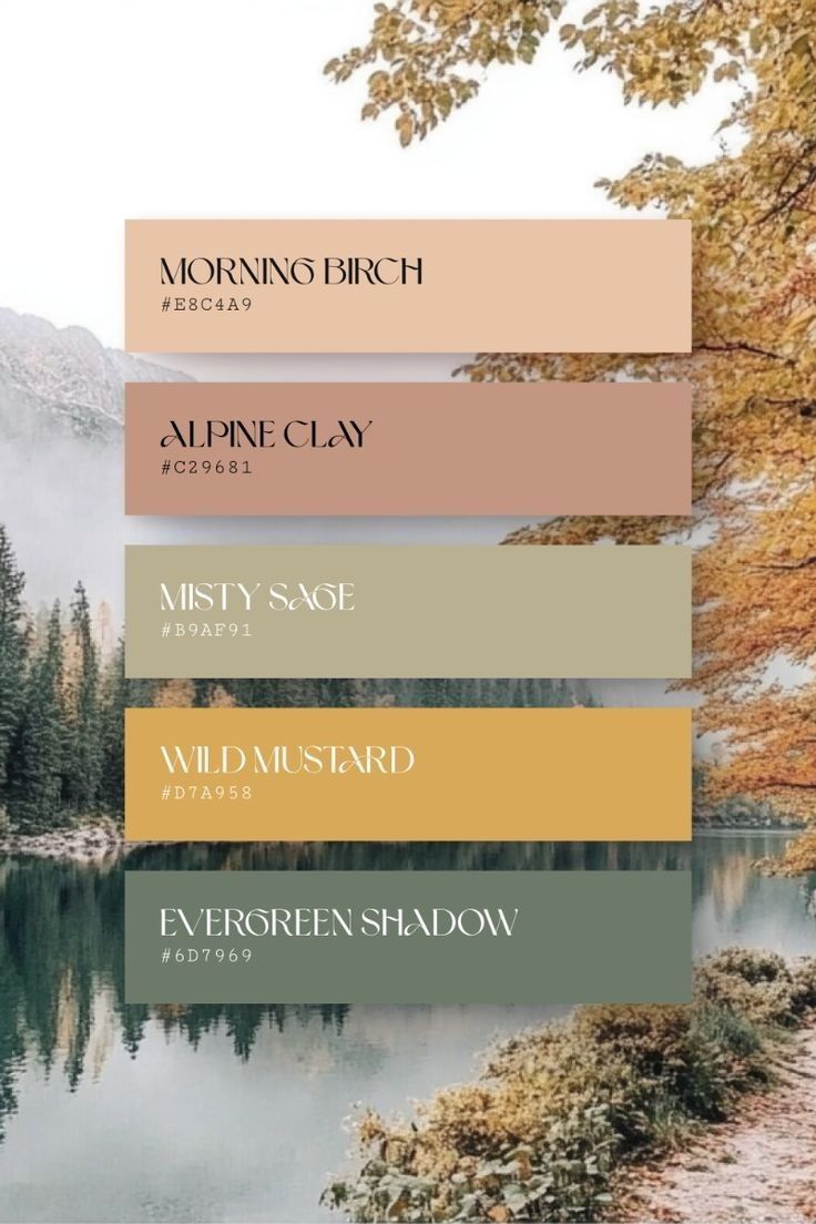
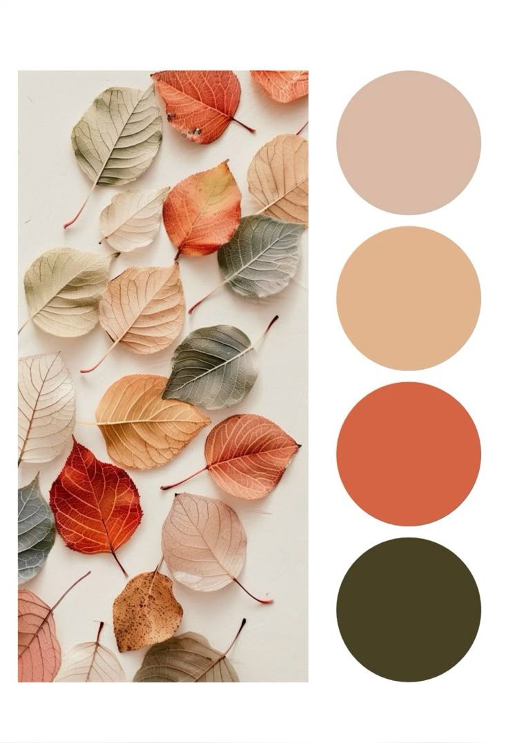
When it comes to fall and winter sessions, think earthy, timeless tones that complement the soft light and cozy atmosphere of the season. Warm neutrals like cream, camel, rust, and chocolate brown photograph beautifully against autumn leaves and bare branches, while deeper shades such as olive, forest green, maroon, and navy add a rich, romantic touch. In winter, layering soft taupes, charcoal, and ivory keeps the look classic and refined. Aim for textures over patterns — knits, corduroy, flannel, velvet, or wool instantly bring depth and warmth to your photos. Avoid bright neons or overly busy prints so your connection (and the cozy seasonal vibe) stays the focus
Spring + Summer Palette
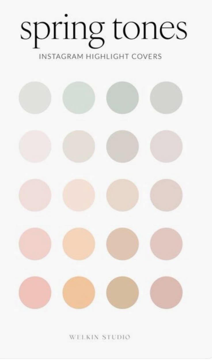
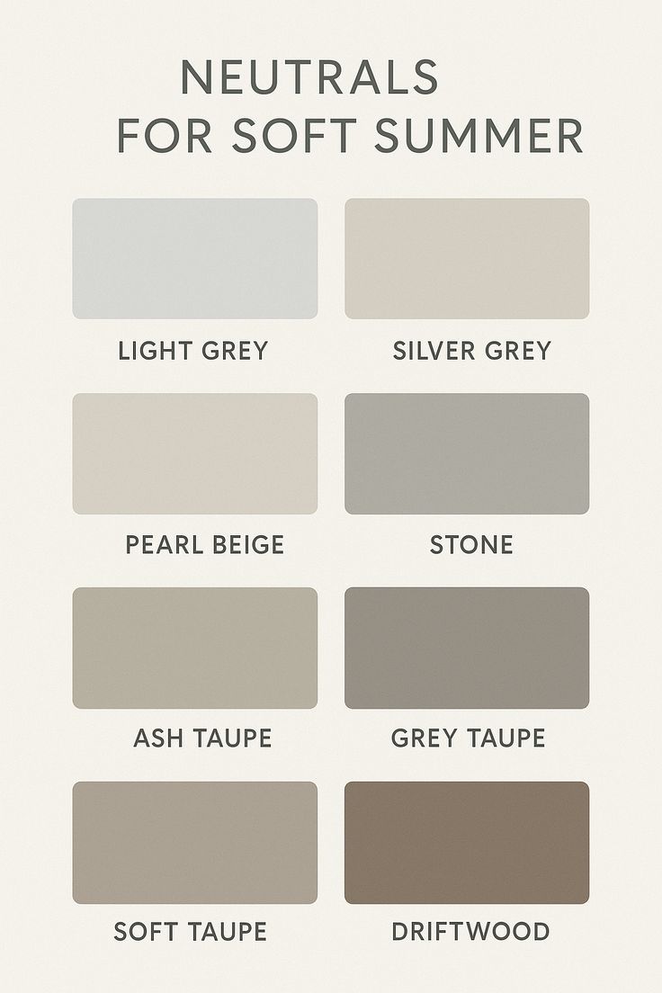
Spring and summer sessions are all about keeping things light, soft, and fresh. Colors like sage, blush, cream, peach, and soft taupe feel timeless while adding just enough variety to keep your photos dynamic. These tones reflect beautifully in golden sunlight, open fields, and creekside settings, giving your images that airy, effortless feel. For a cohesive look, mix creamy neutrals with one or two subtle pastels — like a flowy sage dress paired with a partner in beige, or blush accents layered against sandy taupes. These shades photograph clean and dreamy, allowing your connection and movement to take center stage.